Monday, April 4, 2011

Intro to Web Work- CSS, Coding, and Cool sites

So last semester I took Intro to Web which is an open elective GIC class. It was really fun learning Dreamweaver and coding because it reminded me of my old myspace days and learning what code to put in to change my background color. I made 5 sites and we had to compile them in a final site which is http://webspace.ringling.edu/~kcruz/ if you're interested in seeing them online and in action!! My first few sites suck but it was fun once I got the hang of it.

This is the main page with the highlighted hover action.


My first site! ughh so bad lol.

My second site! so bad yet so cute because of my cat Sushi.


This is 3rd site, a mock music site.


This my portfolio site, the final site I made.


My favorite site was an informative site about an simple object that we picked. I chose glasses but wanted to explore them in a fashion timeline. I made all the icons/patterns and picked colors that reflected each time period. Here are some screen caps it.

Glasses vectors

Objects from the different eras.

Main page

Bifocal page


Cat Eye page

Hipster page

All 9 pages together


Hope you enjoy!!

Saturday, March 19, 2011

Cappuccino Pillow

So after doing two editorials, I decided I wanted to have work for my "cutesy" portfolio. I wanted to do a pillow design and make it by hand with a cute image on one side, and a pattern on the other side. I found out that Michael's has fabric paper that can be printed on so I printed them in the labs, and tried sewing them the night before my critique at the 3d labs where there are sewing machines. OF COURSE they weren't working and I ended up going to a friend's house to sew it together by hand. Then I slightly ironed it to flatten the top but the ink mushed away. I don't have a picture of the pillow but it was 5 inch by 5 inches and it was too cute for words.

My teacher was confused because he thought with the coloring and style that this pillow was for kids, but kids don't drink coffee. I told him it was for Urban Outfitter type store where grown ass people drool over cute plushies (me being one of them). I changed the colors from pastels to more vibrant ones which is what is here now. So enjoy! and maybe I'll make the pillow again one day!

Friday, March 11, 2011

Double Talk

This piece was from last semester and it's an editorial about Bilingualism! The article was about how people who speak two languages are awesome and that being bilingual benefits them in many ways. I wanted to show language without letters so I thought about shapes or as my teacher suggested "word turds". I thought about how German sounds very structured and rigid when spoken, hence the shapes on the left. When someone speaks French, it is fluid and pretty, which are the shapes on the right. The person can speak both so having two mouths and the language intertwining seemed fun! Here's the process. Enjoy!


Thursday, February 3, 2011

2010 work- First Project

Heyyyyyy,

So I guess I've been hiatus. Last semester we had a bunch of open assignments and I varied them to tailor different styles/portfolios. I realized that I couldn't decide on one style (not because I'm indecisive, I just don't want to limit myself) so I pinned down my styles to Editorial, Cutesy, and Creative. I'll be updating this with last semester stuff in the next few days... I PROMISE!

My first project was an editorial based on an article in Psychology Today. It was about how introverts aren't necessarily antisocial, but like to reflect and organize their thoughts. A nice quote from it was "Introverts are collectors of thoughts and solitude is where the collection is curated and rearranged to make sense of the present and future." Here is some process work.


Thumbnails


More thumbnails


Revised thumbs


Tight line


Value studies


Color studies


Final!!


I was really happy with how this turned out. Even though some people mention it looks like her guts, I wanted to convey her brain and how she "organizes" her thoughts into brain-like containers. Puzzle pieces would have been to obvious. Hooray for conceptual thinking!

Tuesday, November 23, 2010

MUPALIA

Deaf Poets - All Your Lies from Mupalia Pictures on Vimeo.


This summer I asked my cousin if he needed help with a logo for his film production company, Mupalia Pictures. They had a few things under their belt and had just released this video by the Deaf Poets who are an up and coming band from Miami that are really great performers.

I wanted to see what it was like to do a piece without the help of a teacher. His team said they wanted to have something iconic, and involving a cool guy with a beard. It's funny because my cousin usually wears wayfarers with his an Al-Queda looking beard so it matched haha. The first one is the one they went with, and the second is something I came up with tonight after not seeing it for a while. I figured the black beard makes the words easier to read.

THEY ARE SUPER SO CHECK OUT THEIR WORK! Vimeo and Mupalia.com
Also, check out The Deaf Poets!


(Judging from my header, can you tell I like drawing Wayfarer sunglasses? lol)

Monday, November 1, 2010

Throwback Junior year Illustration

This is some work from Junior year. I realize I like primary color schemes a little too much lol. It was a busy year and I was able to get some great work for my portfolio.


Remember this first doodle? Well she turned into the next two pieces!


My pretentious girl character sheet. Her name is Michéle and she is a recent NYU drop out who first came here from France. She felt she was too good for school. She's was inspired by all the cool hip art students I've come across.


Her favorite spot to judge people who pass by.


This assignment was to create a poster for a job. My job was sheep shearing and my teacher suggested I have the text sheared into him.


Sheep Shearer final. During critique classmates thought he was in a bubble bath lol. I was having a pattern/ texture phase last year so I spent about 1 hour drawing those swirly circles. The piece is about 20 in by 30 in so my hand was tired. Acrylic and color pencil.


This was an assignment to create a series where our pieces had to be develop from monochromatic to complementary to triad. The subject matter was self consciousness among women and their body image. I wanted to focus on those parts they try to hide and use color to glorify them because women are beautiful yo! Acrylic on 16 by 16 in canvases.

This was a sketch about a femme fatale and her relationship with her loser dancing partner.They are using each other to get something they want. She uses her boobs to get to his wallet. Ain't that the truth. The final wasn't great, but the line drawing is cool.


This was in advanced media and the theme was fantasy/ folktale. This cute satyr is just chilling with other kids during lunch and no one cares that he's different. yay!


Portrait I did of my friend Lindsay. Oil is awesome.

Wednesday, October 27, 2010

Throwback sophomore year

This was a repackage project I did for Intro to GIC sophomore ear. I recently did a hands on project with sewing so it's funny to look back on the other things I've constructed. Wouldn't you prefer this on the grocery shelves?!


Sunday, October 24, 2010

Throwback post

oh hey blogger!

Senior year has been busy! I've been in the labs almost every night and my bed times are ridiculous. It's all good though. Anyway, I feel like I have to update last year's stuff before I can update new work. I am running on Cuban time so I apologize for the lateness. I'll start with figure paintings from junior year. I had the class for a whole year with Hodges Soileau who was an amazing teacher. He would point out things I didn't see, and really helped me understand shapes, value and color, even though I still have value issues. It was a fun class. These are pretty much in chronological order so enjoy :)


my stylized face


I thought this would be safer in case children were around... but watch out for the next one!


mr. boner has a tendency to stare down girls in the class with an erection. I was unfortunate enough to get a spot right in front -_-


my favorite part of this piece is her booty.


this chick played a guitar with no strings! It's not like I forgot to paint them in or anything...


this guy was in a weird position that he couldn't hold for more then 5 minutes at a time before shaking and having to rest. I felt bad, but it was a cool pose.


I was taking art history at the time, so maybe I was influenced by the baroque period? Old school chick.

Anyway, I had fun in painting class and hope to continue with oil when I have time.

Wednesday, September 1, 2010

Long time no see

Hey everyone!
I'm not going to acknowledge the fact that I haven't posted in forever. I feel like junior year was great and I'm going to miss Advanced Media and Figure Painting because I learned a lot. Summer was fun in Miami- taking summer classes, working for a month as an office assistant and getting a CAR FINALLY!! Went to LA for a week and loved it. I also had my fair share of TV with Man vs. Food, Cake Boss, Ace of Cakes, Cupcake Wars, and DC Cupcakes. You know, a variety of things. I'm so excited for this year! Enjoy some stuff from last semester I finally updated :)


Balloon Boy Hoax editorial. This was a double page spread about how the parents wanted publicity and their own reality show and could care less about how they were exploiting their kids.


Song Reader Book Cover. The story is about this therapist in a small town who asks people what their favorite songs are. From there she can tell how they are truly feeling and can give them life advice based on that.


Open Assignment Editorial about a girl's reading preference. This is about a girl who is surrounded by superficial beauty and fashion magazines, but decides that she prefers to read the newspaper. It was a bitch cutting out all this stuff but the collage look is really cool.


This was for children's book illustration class last year! My story from creative writing in high school was the basis for the Lucy Mckay adventure. I was going through a phase of patterns and textures if you couldn't tell lol.


Man Pet Machine pen and ink. This is what I came up with for the infamous Advanced Illustration project Brandes gives out. I went the cutesy- children's book-Shel Silverstein route.


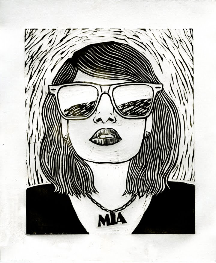
Linoleum cut of MIA. I had so much fun with this and we started the project the day before MIA's video for "Born Free" came out. Good thing Ron Weasley wasn't in town!


Linoleum cut of MIA with color. This took me forever to wipe the color out correctly. Printmaking is still awesome though.